
Home > INT3 > Chapter Ch9 > Lesson 9.1.2 > Problem 9-18
9-18.
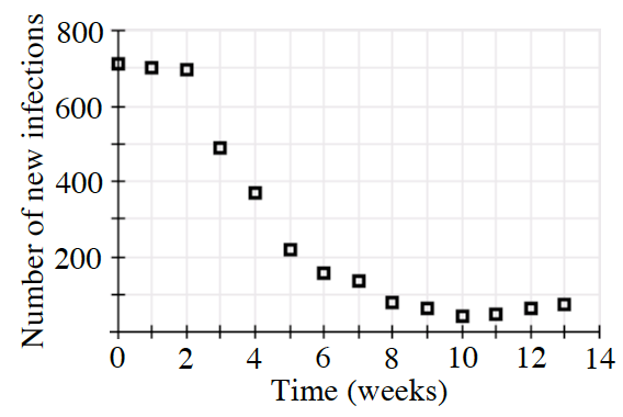
Upon arrival in a virus “hot zone”, you set up a field hospital to treat patients, and attempt to prevent the spread of the virus. For the next thirteen weeks, you collect the data shown at right for the number of new infections.
Choose several interesting time periods and estimate the average rate of change in new infections.
Explain why you chose the intervals you did.The average rate of change is another way of saying the slope of the graph.
During what time period were the interventions most effective? Why?
When the interventions were most effective, there were fewer number of new infections.
Is there any time period that is concerning? Why?
After
weeks the number of new infections seems to be increasing!