CPM Homework Banner
5-23.

Match each table of data below with the most appropriate graph, and then briefly explain how you know the graph matches the data.

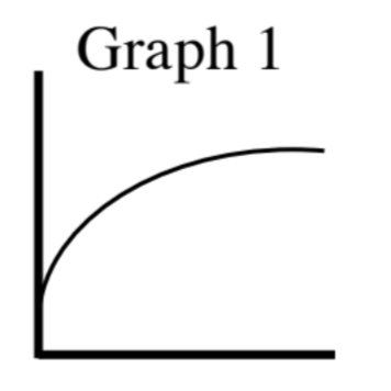
  1. The temperature in an oven when cooking a roast.

Time (min)

Temperature ()   

The temperature rises immediately but as time passes it levels-off.

Graph 1

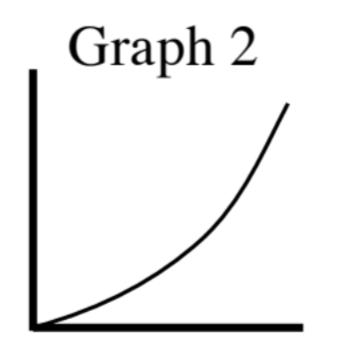
  1. The time needed for an athlete to run a certain distance.

    Distance (meters)

    Time (min:sec)

    0:12

    0:25

    1:10

    2:24

    5:20

    10:59

Graph 2

First quadrant, axes unlabeled, titled Graph 1: Increasing curve, opening downward, starting at 1 fourth way up, rising, then leveling out.

First quadrant, axes unlabeled, titled Graph 2: Increasing curve, starting at origin, opening upward, rising gradually, then rising rapidly.

First quadrant, axes unlabeled, titled Graph 3: Upside down V, starting about 1 fourth up, rising, & turning half way on the x, falling at the same rate.

First quadrant, axes unlabeled, titled Graph 4: Increasing curve, starting just above the origin, opening upward, rising gradually, at half way, rising very rapidly, turning to opening down, then leveling off.